

OBJECTIVE
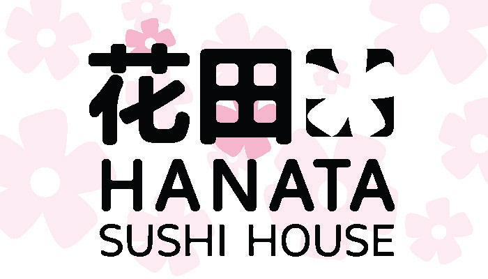
This logo is meant to represent the roots of Hanata’s name, the personality, and
quality of the Restaurant in a clean and recognizable way. While still keeping it
joyful and fun with a splash of pink flowers, showcasing the beauty of its name.
This logo is meant to represent the roots of Hanata’s name, the personality, and
quality of the Restaurant in a clean and recognizable way. While still keeping it
joyful and fun with a splash of pink flowers, showcasing the beauty of its name.
PROCESS
The logo creation process for Hanata involved a deliberate approach to
encapsulate the brand’s fundamental elements; its name, personality, and the
quality associated with the restaurant. The primary objective was to convey
a clean and easily recognizable representation. The design aimed to infuse a
sense of joy and fun, with the intentional addition of a splash of pink flowers
to highlight the beauty associated with the restaurant’s name. Throughout the
creative process, careful consideration was given to striking a balance among
these elements, ensuring that the final logo not only aligns with Hanata’s
identity but also effectively communicates its core values and appealing
aesthetics.
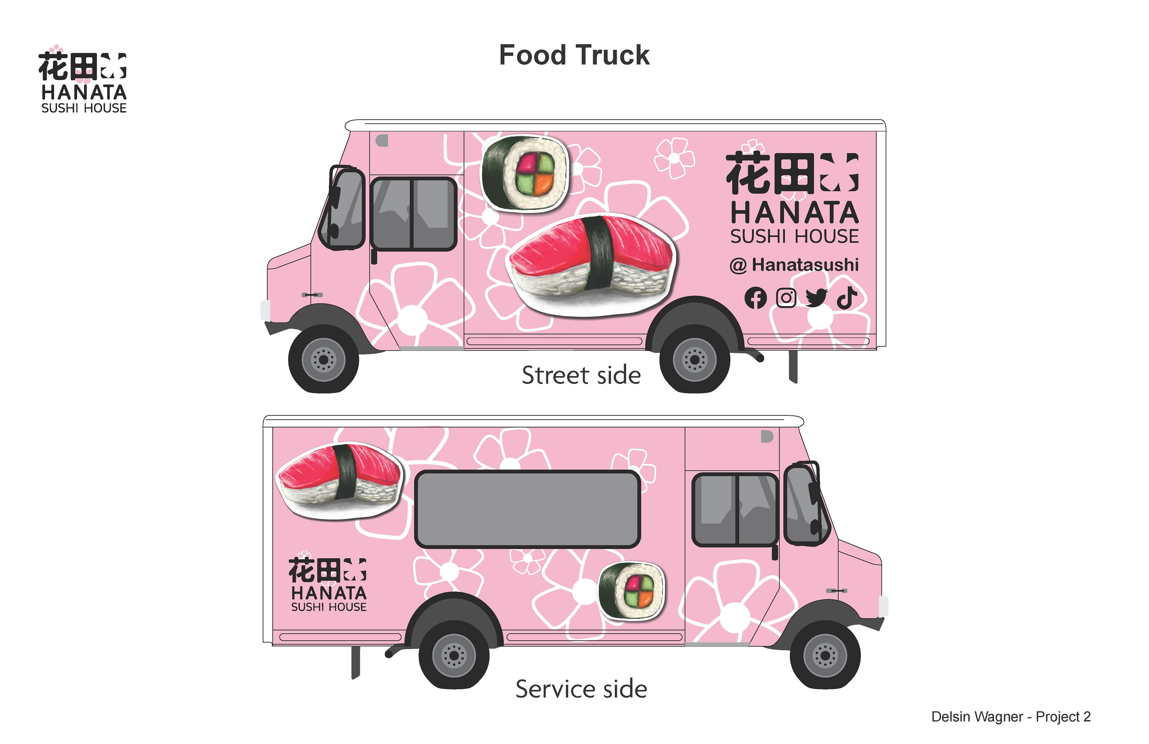
MEDIUM/TOOLS USED
Illustrator, InDesign
The logo creation process for Hanata involved a deliberate approach to
encapsulate the brand’s fundamental elements; its name, personality, and the
quality associated with the restaurant. The primary objective was to convey
a clean and easily recognizable representation. The design aimed to infuse a
sense of joy and fun, with the intentional addition of a splash of pink flowers
to highlight the beauty associated with the restaurant’s name. Throughout the
creative process, careful consideration was given to striking a balance among
these elements, ensuring that the final logo not only aligns with Hanata’s
identity but also effectively communicates its core values and appealing
aesthetics.
MEDIUM/TOOLS USED
Illustrator, InDesign